
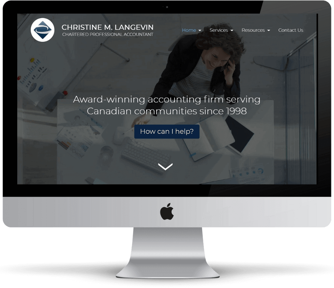
Clear call-to-action front and centre
The purpose of their site is to convert visitors into clients.
With that goal in mind, we chose to put a clear call-to-action,
with an appeal to the potential need for help, right front and
centre on the home page.
Video backgrounds
Every page has a video background as the hero (the first image on a website).
This video hero brings the page to life. It's also more likely to cause visitors
to watch it, thus improving the effectiveness of call-to-actions positioned over the hero.
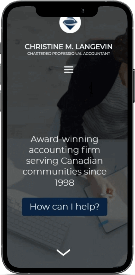
Fully responsive website
Their website is fully responsive on all sized devices starting
with the smallest mobile device on the market to a screen as large
as a television. The full name of this company is "Christine M.
Langevin | Chartered Professional Accountant." which made it
difficult to find a clean way to present that on phones.
A collapsable design was best suited for these circumstances.
It collapses by reconfiguring into a vertical format for small devices.
Testimonials slider on the home page
Christine's clients' testimonials are stored in a rotating
slider right below the hero on the home page. Knowing that "85% of
customers trust online reviews as much as personal recommendations", we
decided to display her testimonials where most prospective clients will
first look on a website.
Font instills professionalism and correctness
We chose a clean, sans-serif font for the website. The font consists of
straight and sharp lettering and is displayed in light and thick formats. The
goal is to convey professionalism and correctness, both incredibly important
aspects of the accountancy profession.

Modular service breakdowns by category
On all three service pages: taxation, accounting, and consulting, there are modular breakdowns
of each service subcategory. This helps potential clients get a more granular view of each
service in a presentable way. It also allows them to only see the information they need.
By having the subcategory information hidden, the page remains clean and usable preventing
problems of information overload (having too much information when making a decision).
Dedicated content areas for expansive content
Service subcategories with more expansive content, such as tax preparation, have dedicated content
areas at the bottom of the page. These areas can be accessed via standard scrolling or the
call-to-action at the top of each service page. Standard scrolling works for potential clients who
are seriously looking for something, while the call-to-action buttons work for those who are casually
browsing.

Interactive service location map
The service location map setup on the contact page is a live interactive map from Google
Maps that contains the location of the business and a connection to her Google Business. They
are a small Oakville-based business; thus, displaying an interactive map conveys legitimacy. It
also helps provide the potential client with an idea of their proximity.
User-friendly email receipts
Unlike many website contact forms, this one provides email receipts of a contact request. It helps
validate to the client that their contact request was made, and it can help with following up, if
necessary. These receipts are designed to match the website style and contain links to their social
media.